
–––
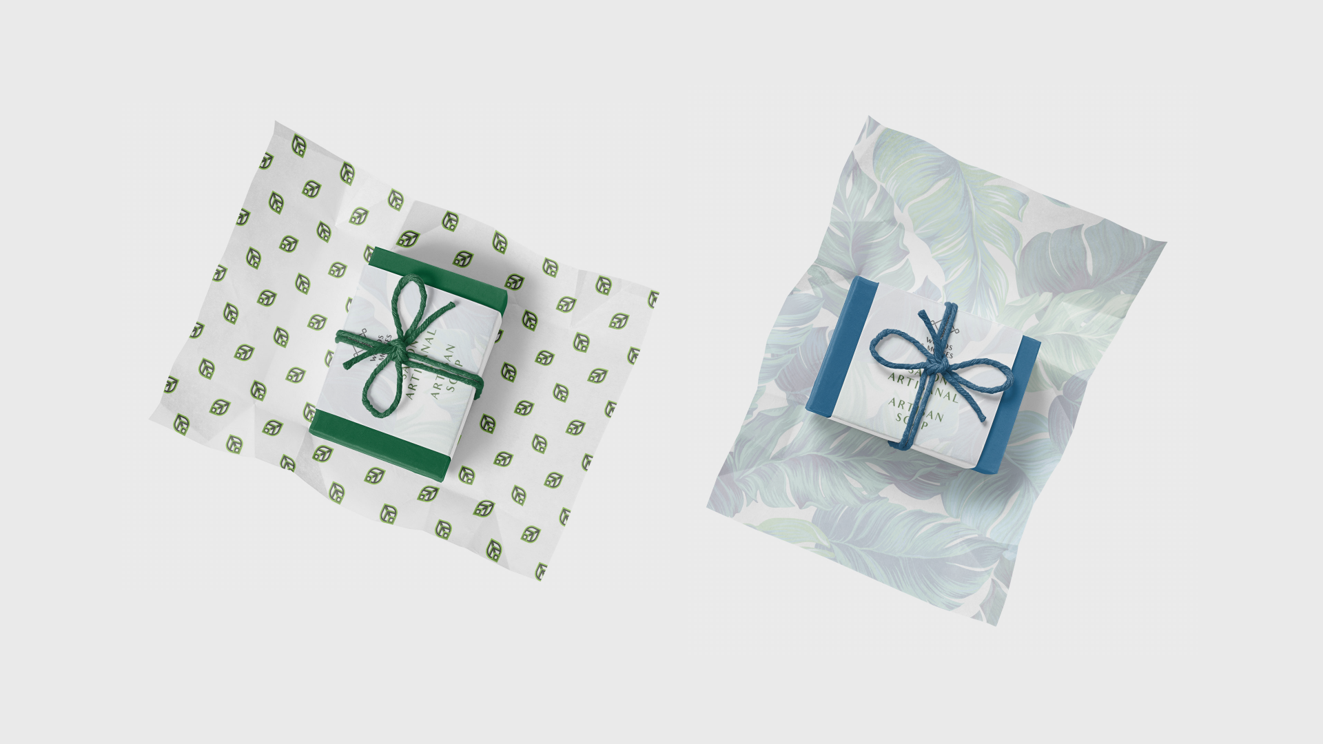
Craft Soap
The client has a hobby. She loves making handmade things, exactly craft soap. Inspire by nature's colour gammas and smells her homemade soap products feel like a part of nature. The name of the shop includes of two words: "woods and mosses" - that represent fresh feelings of woods, gardens; ecological properties of its products.
–––
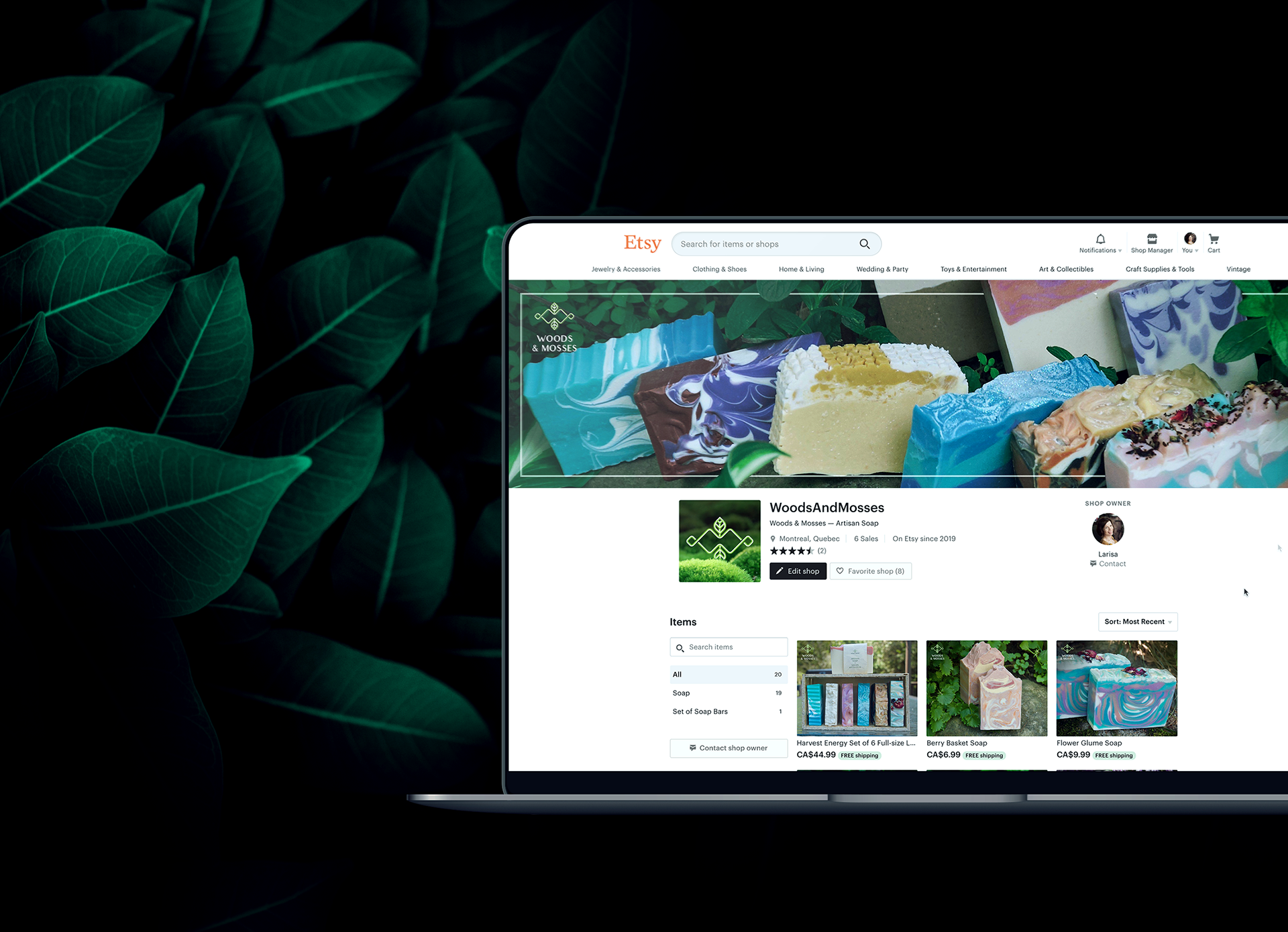
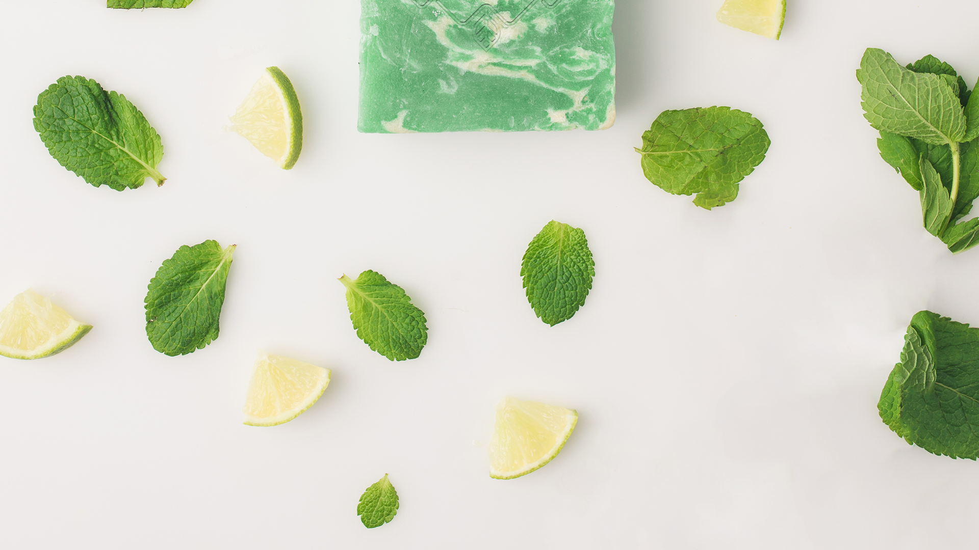
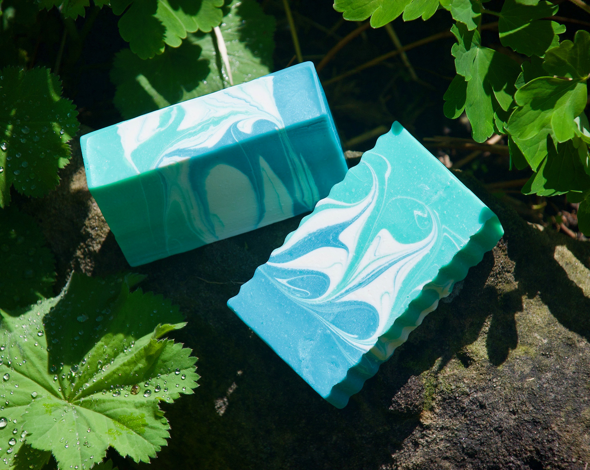
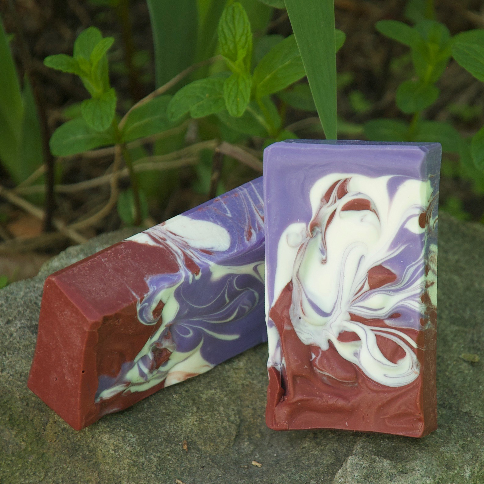
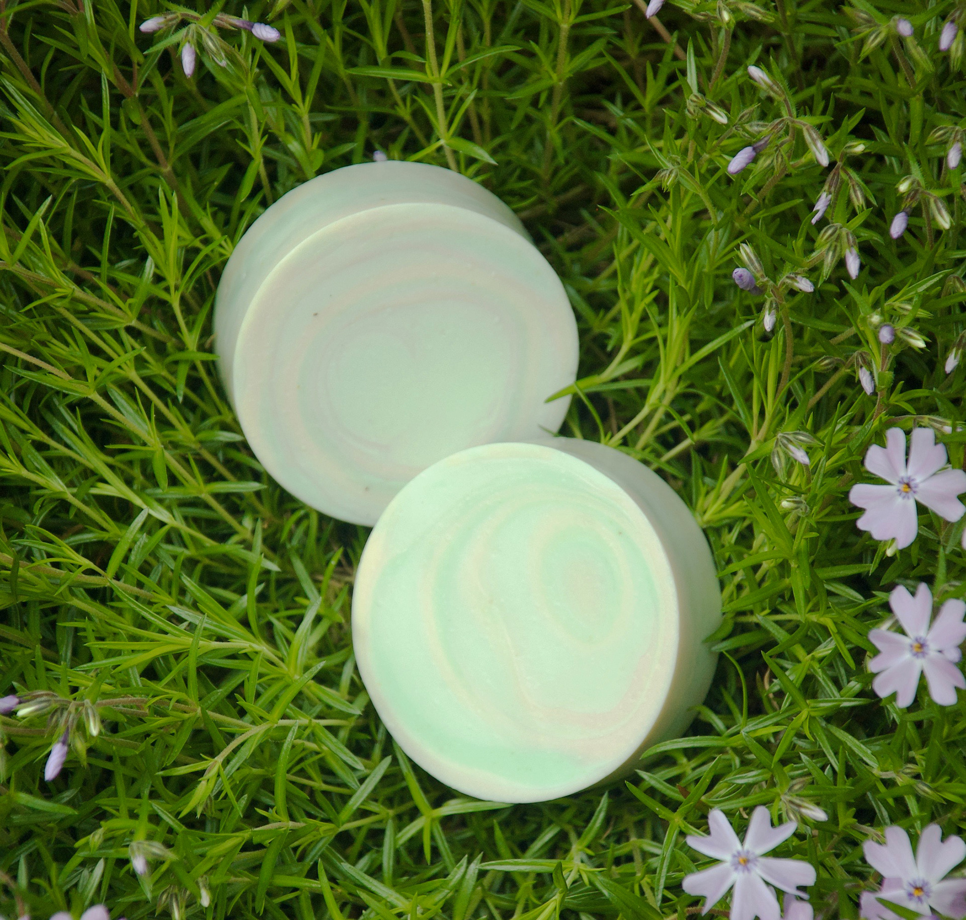
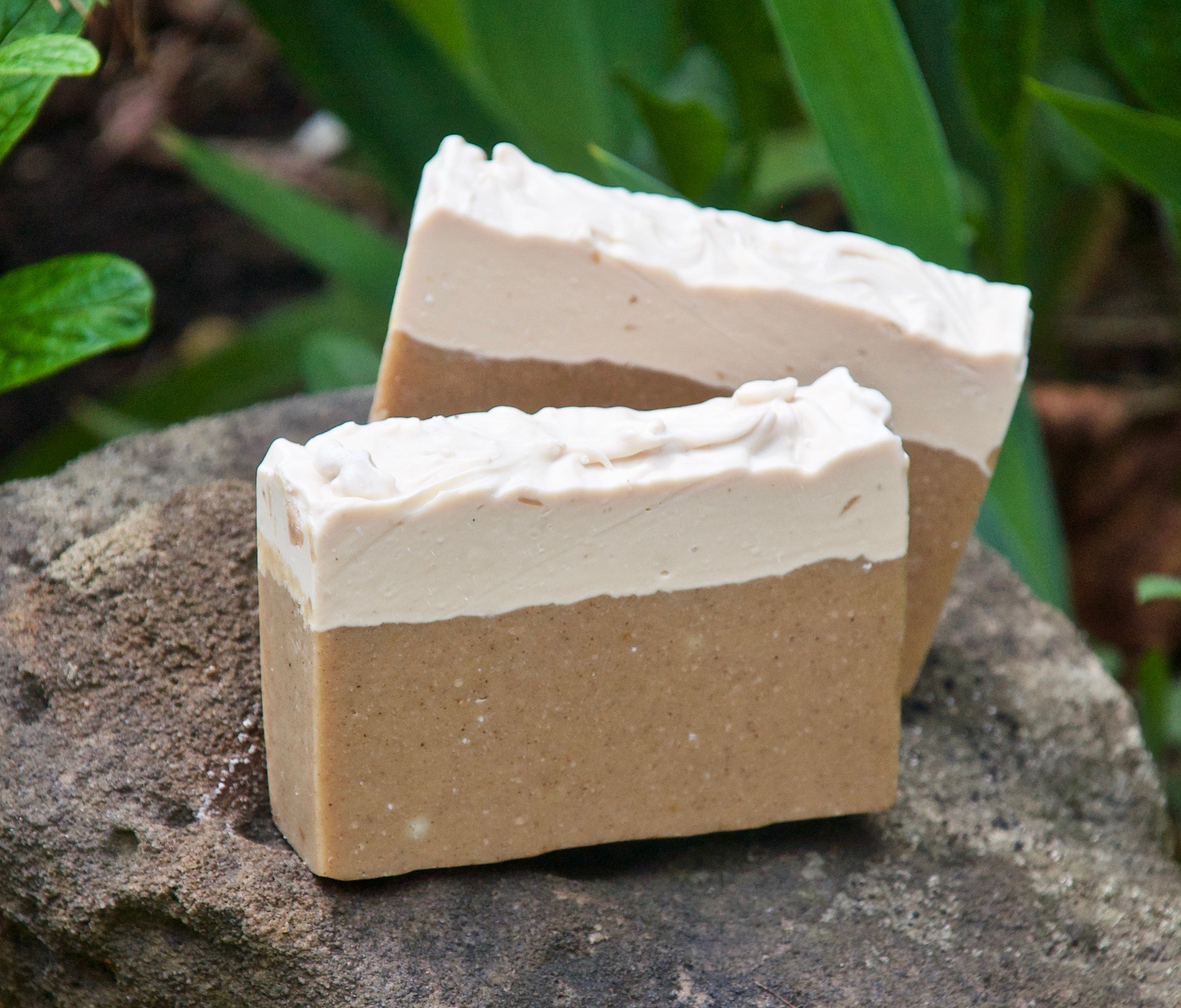
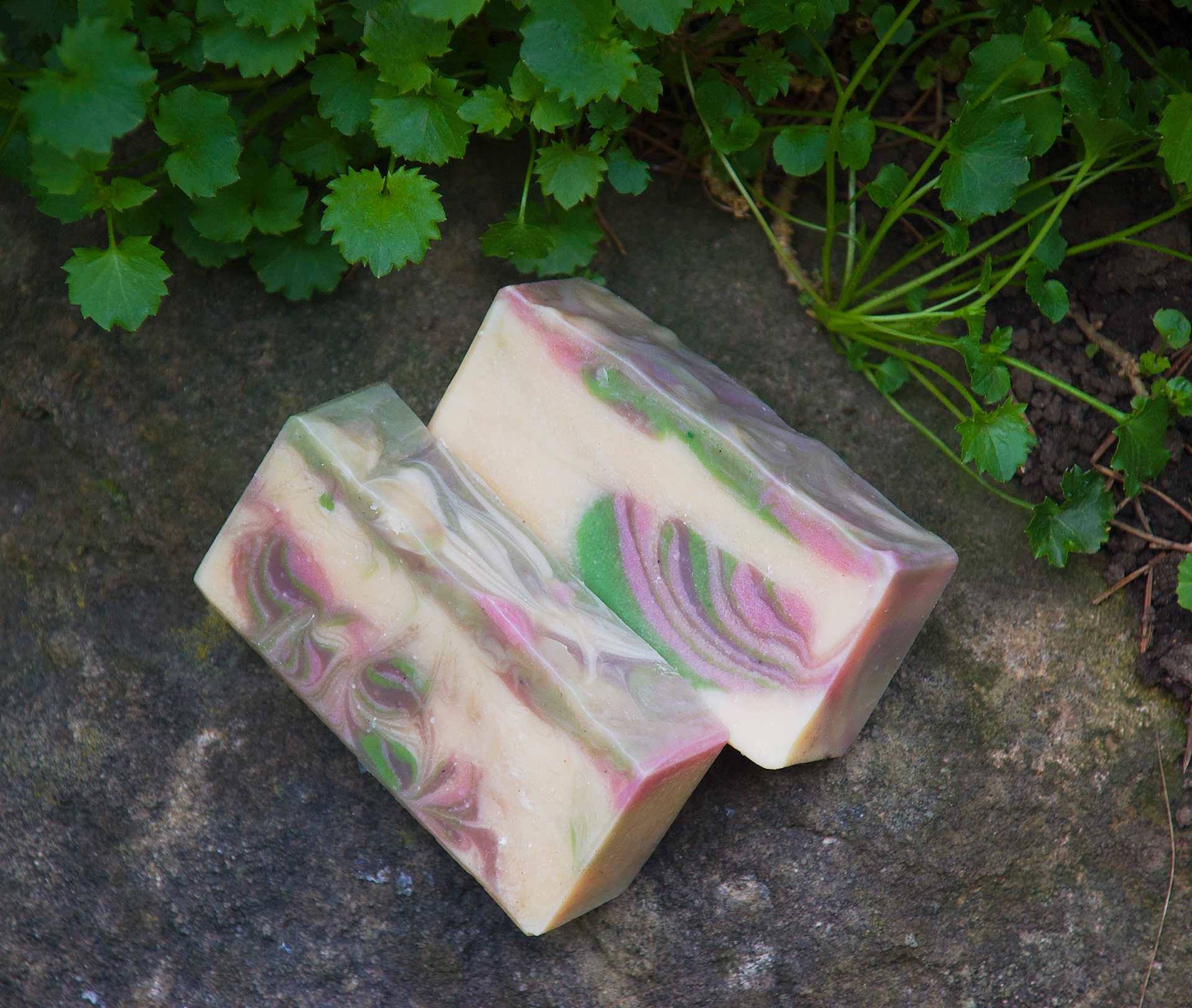
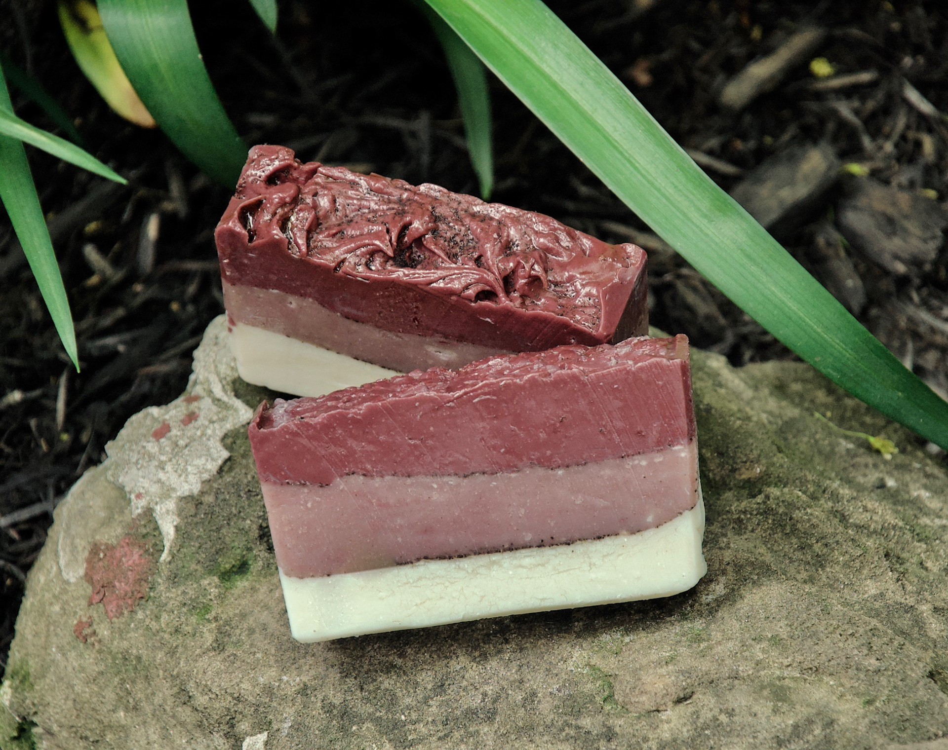
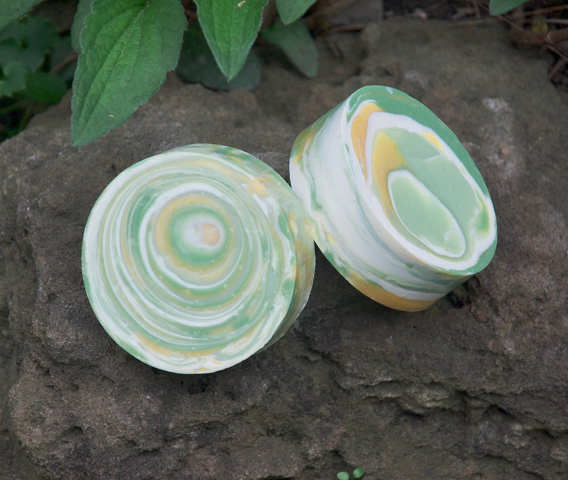
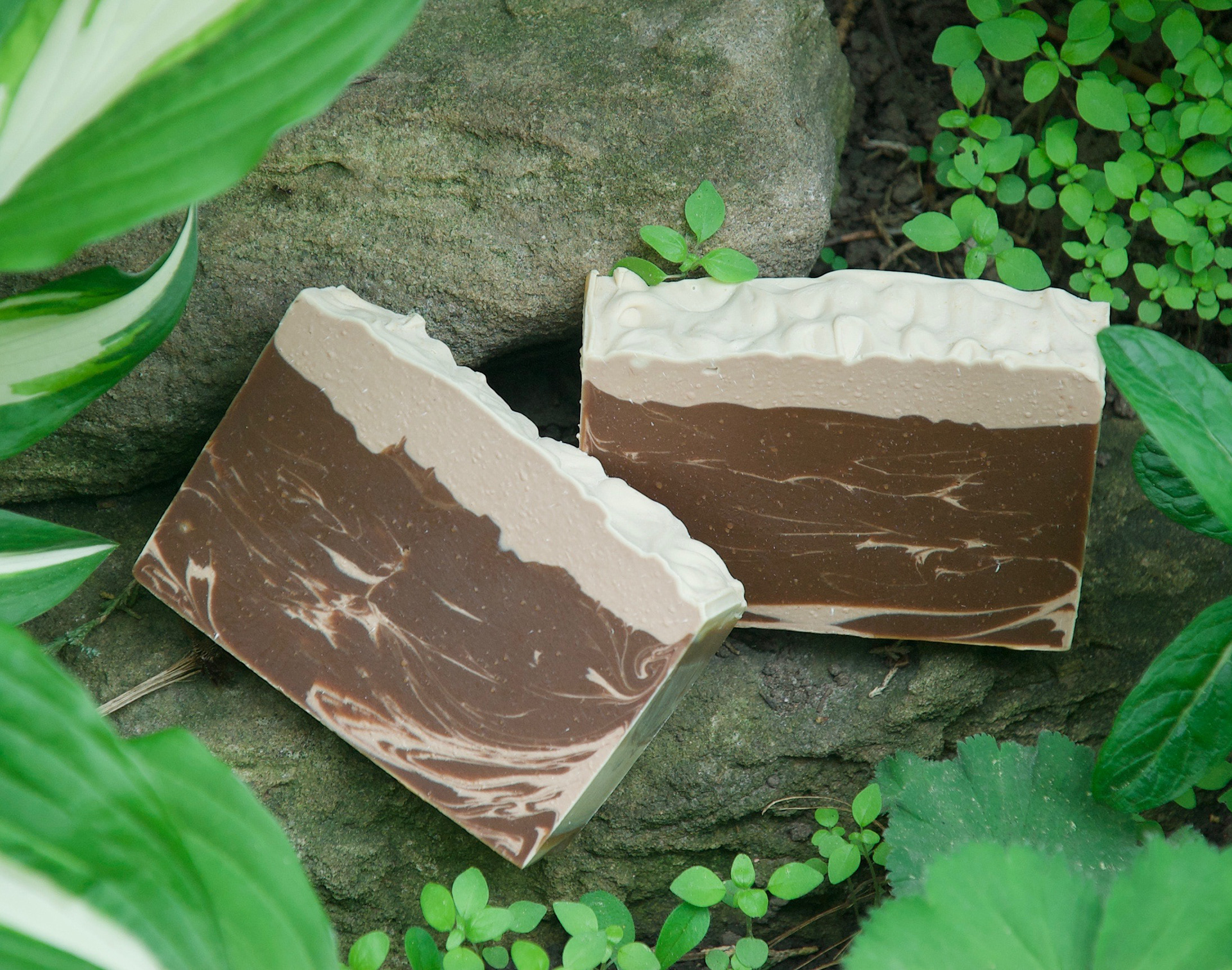
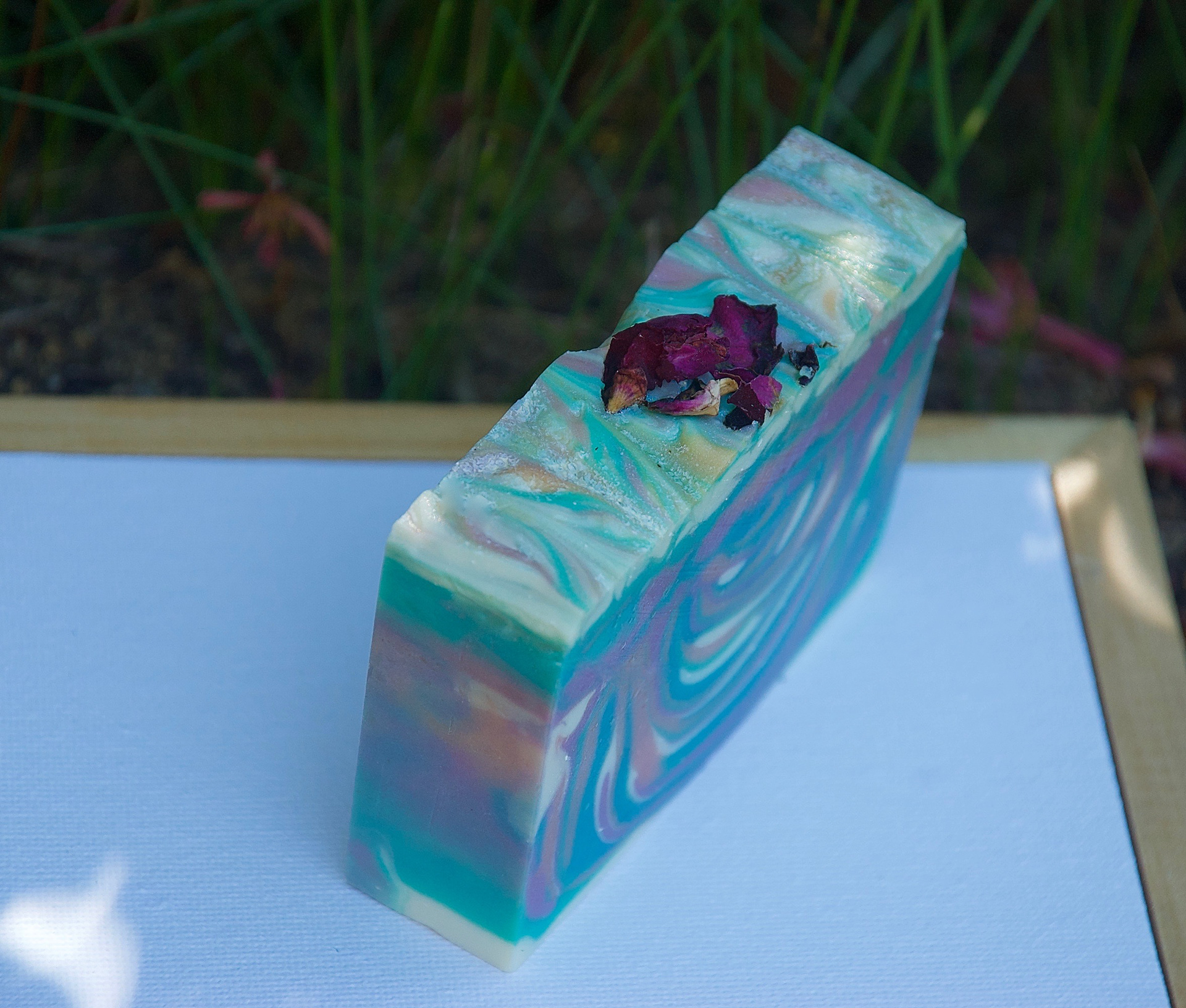
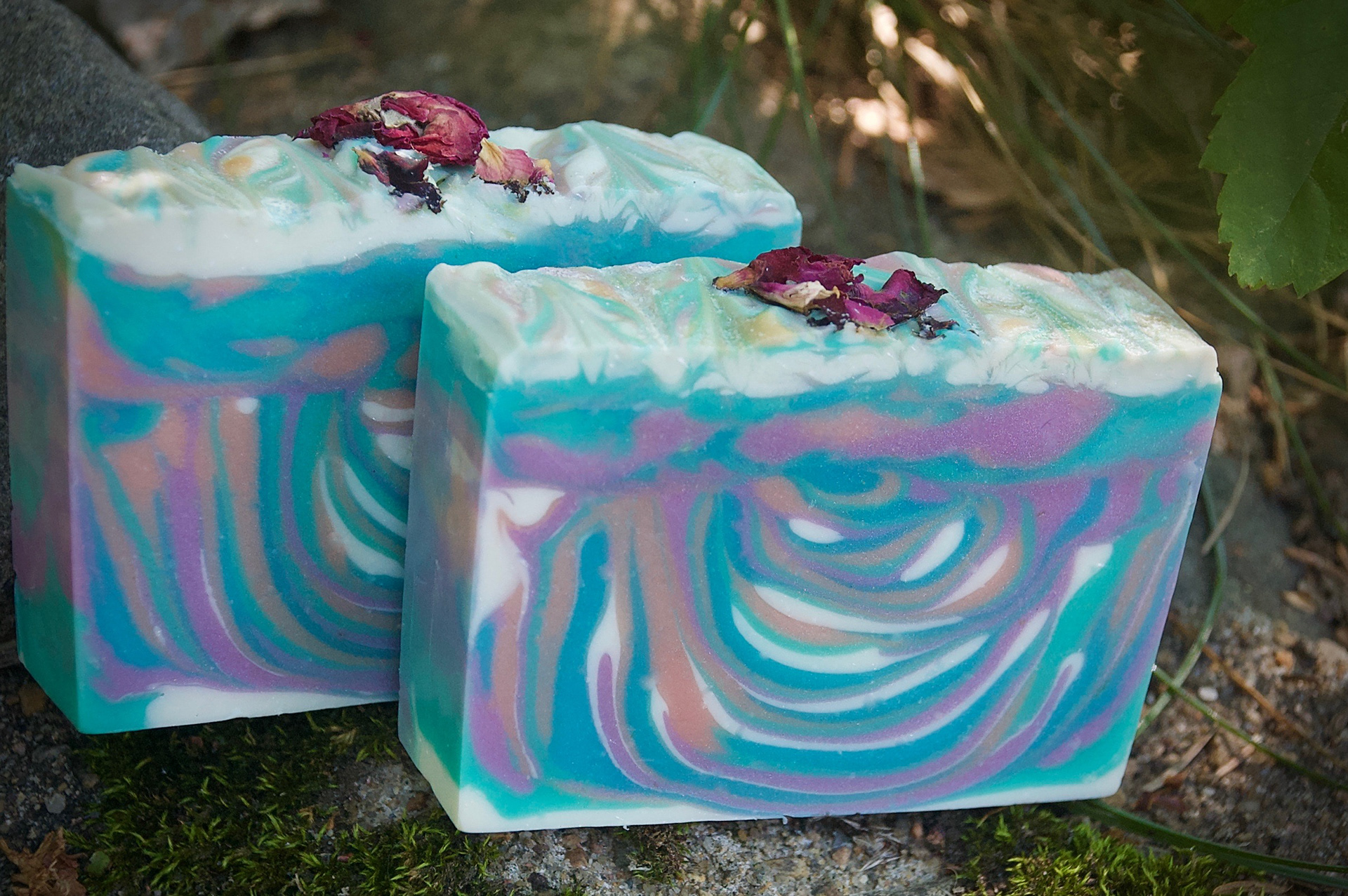
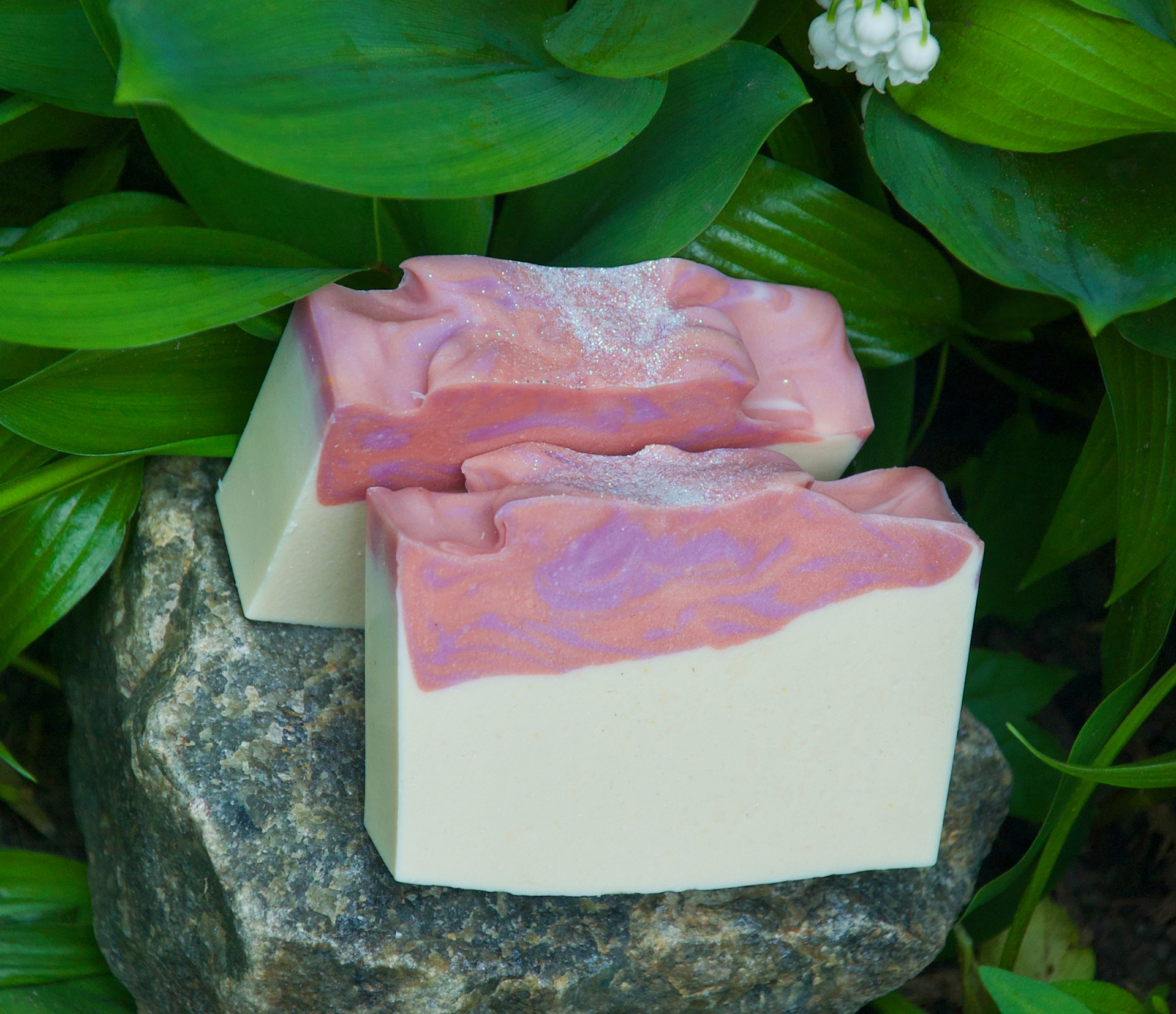
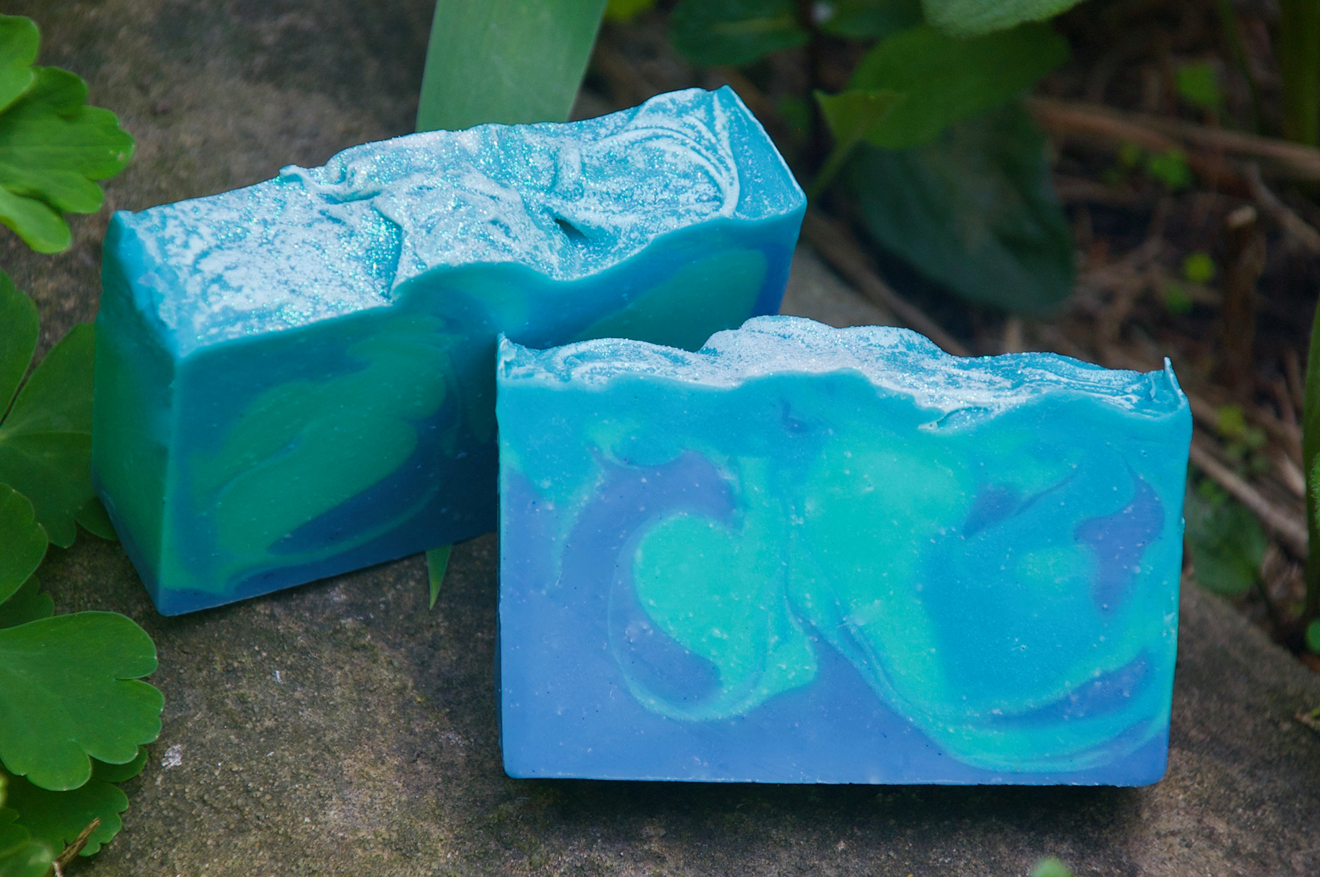
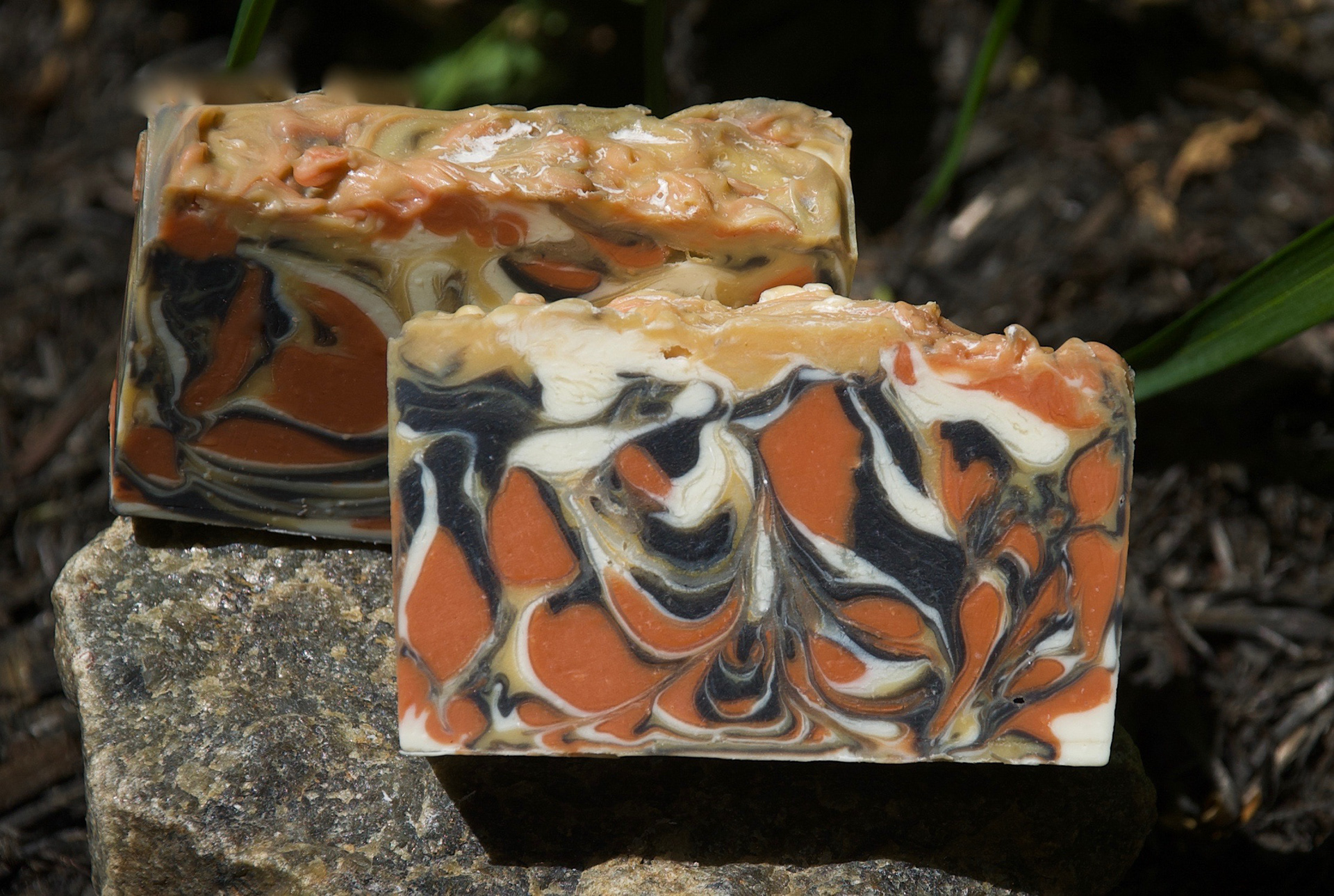
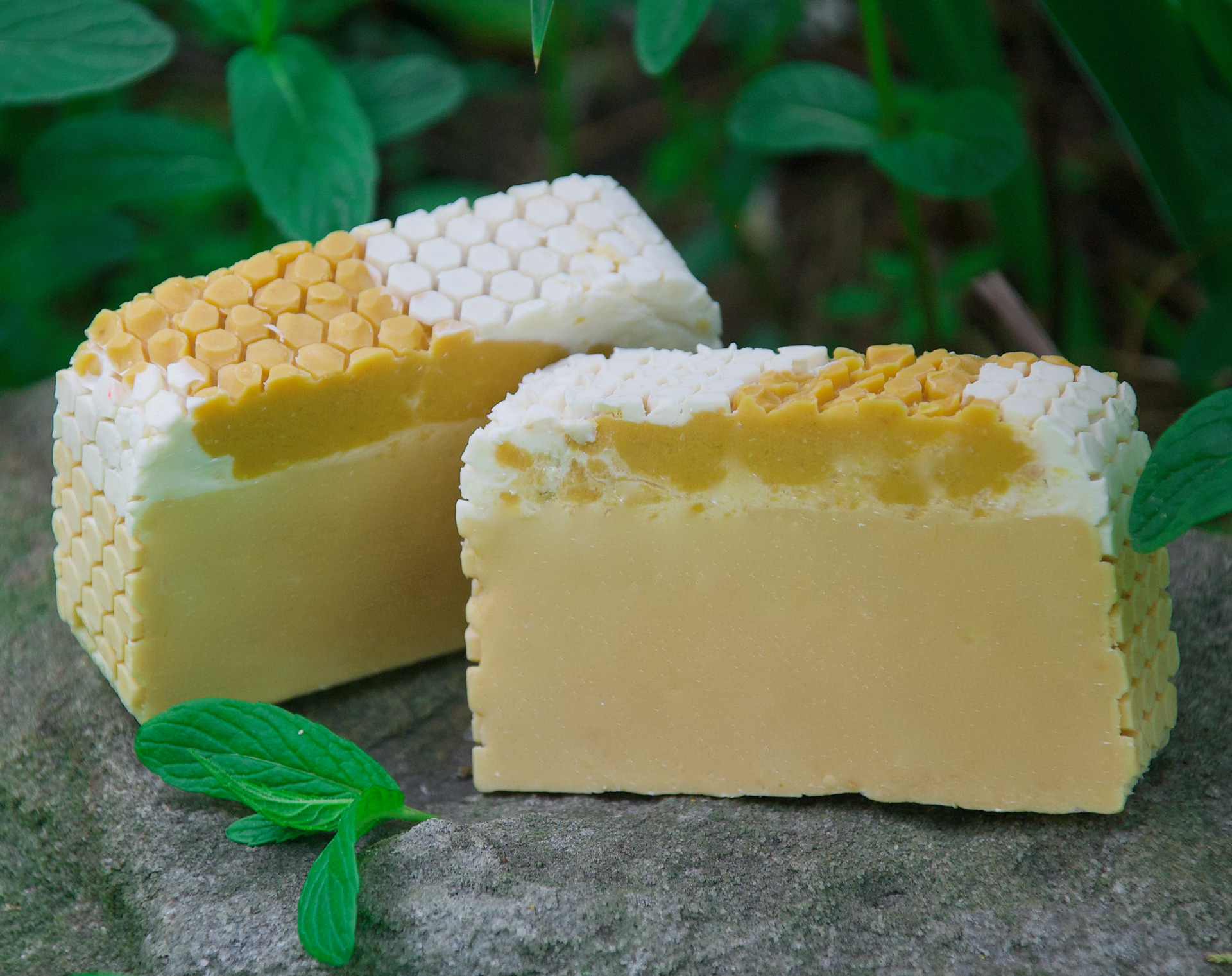
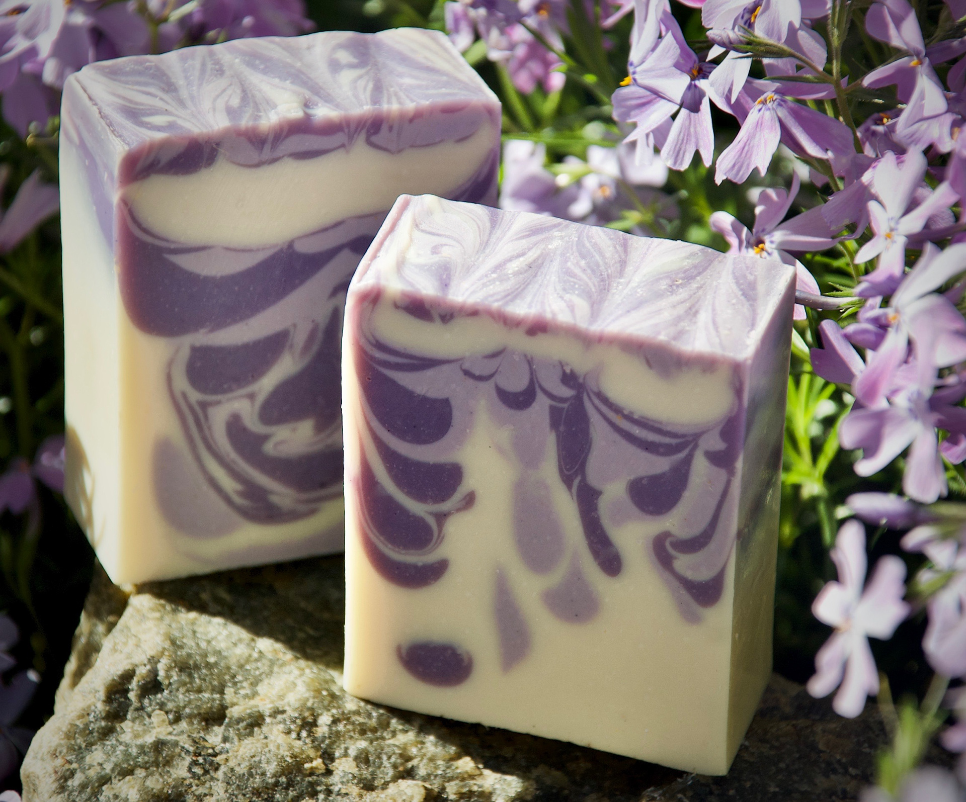
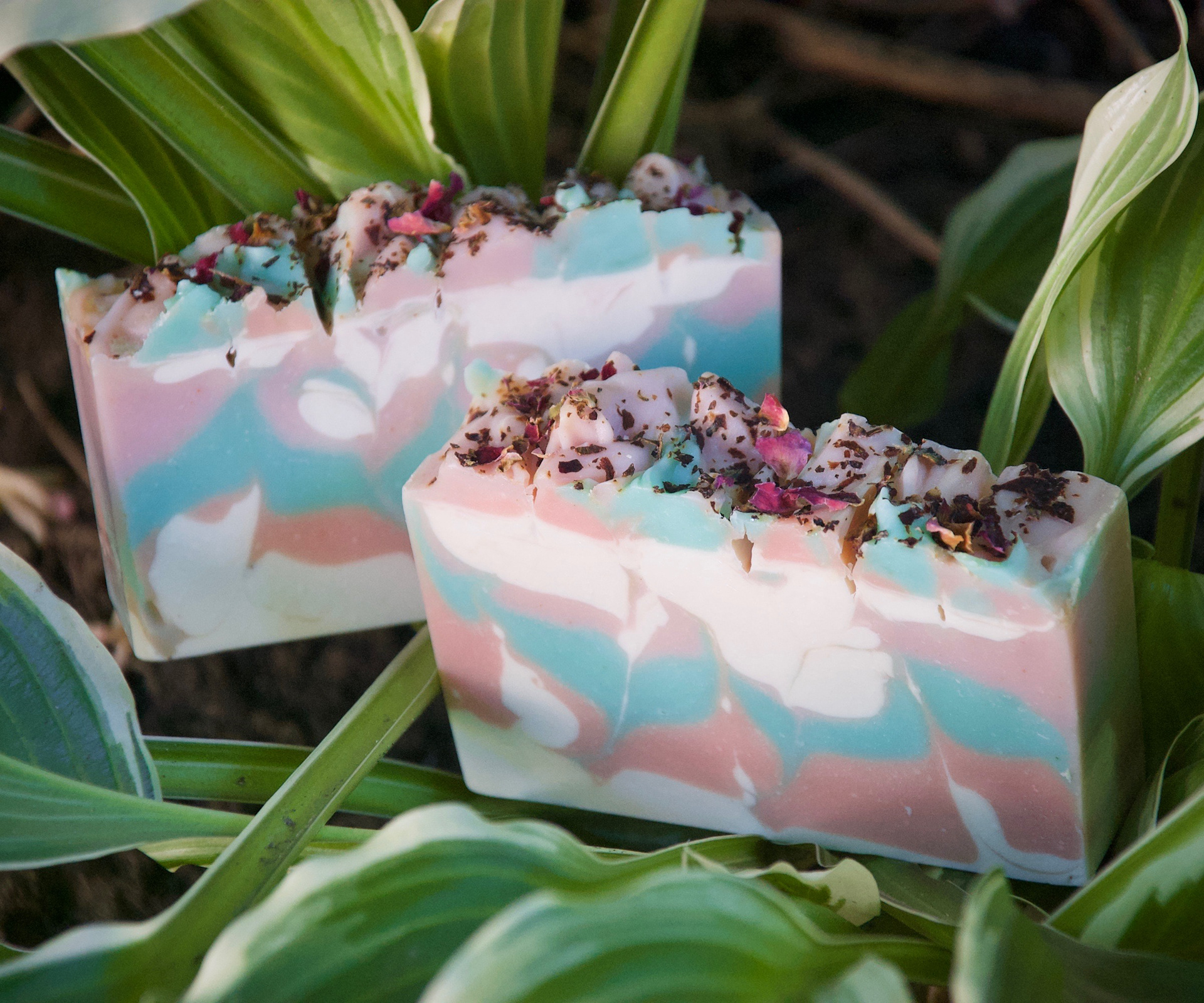
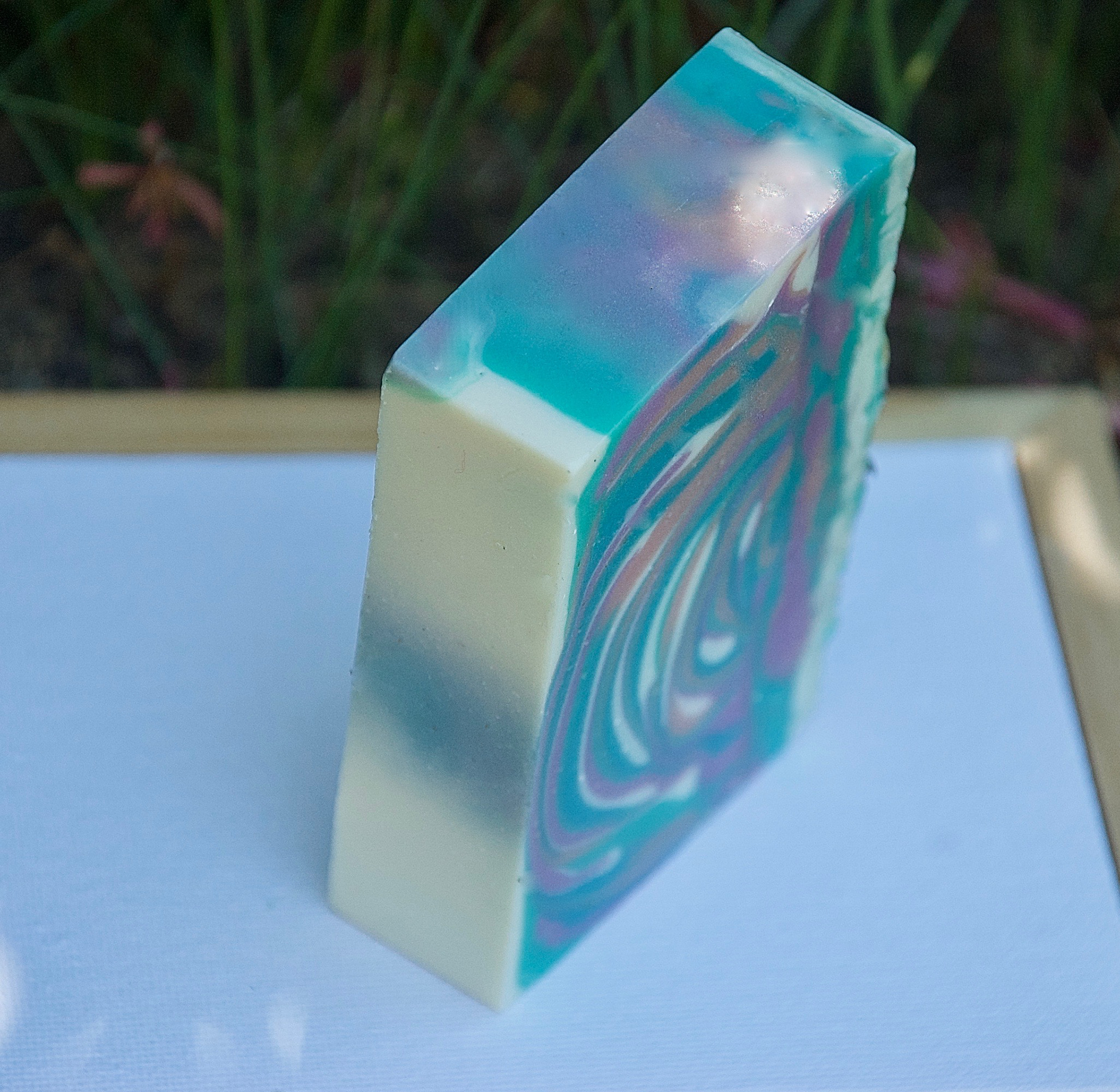
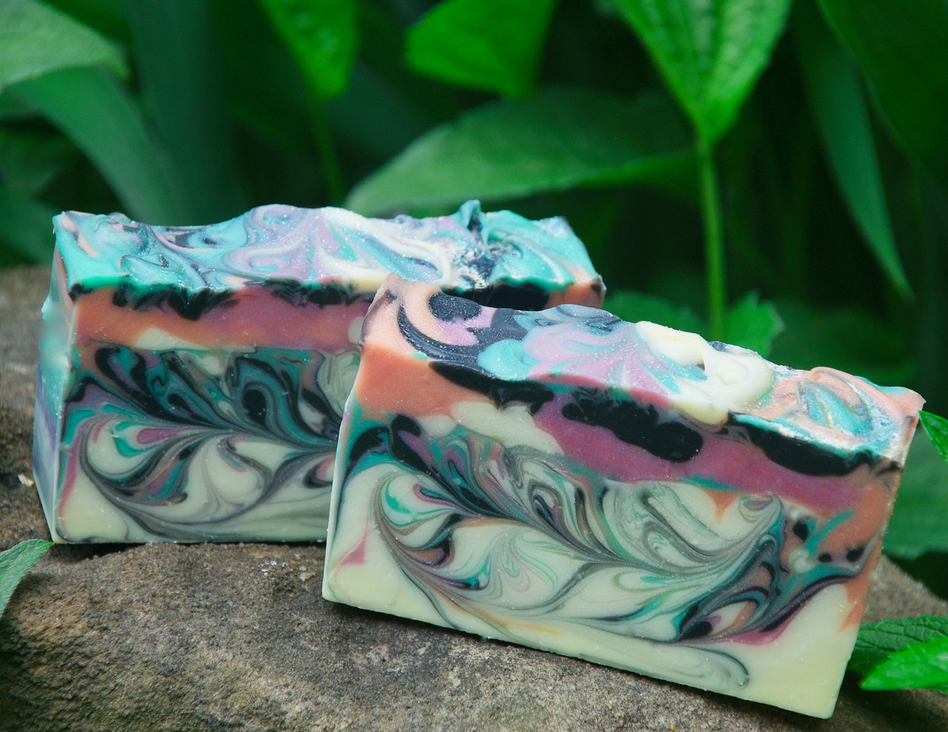
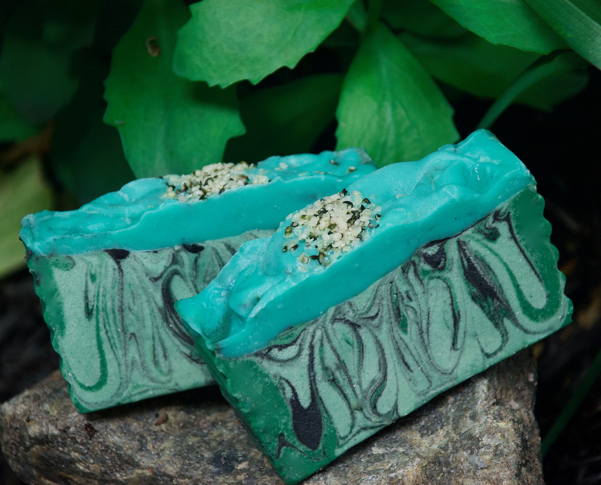
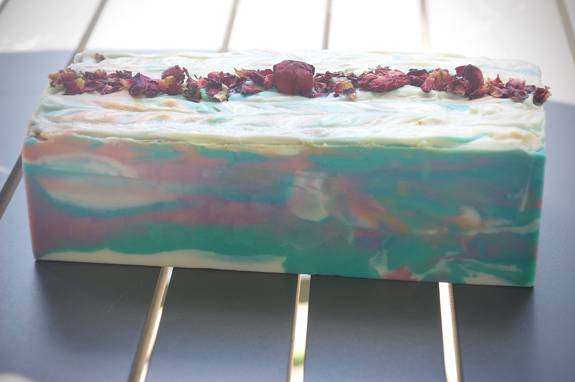
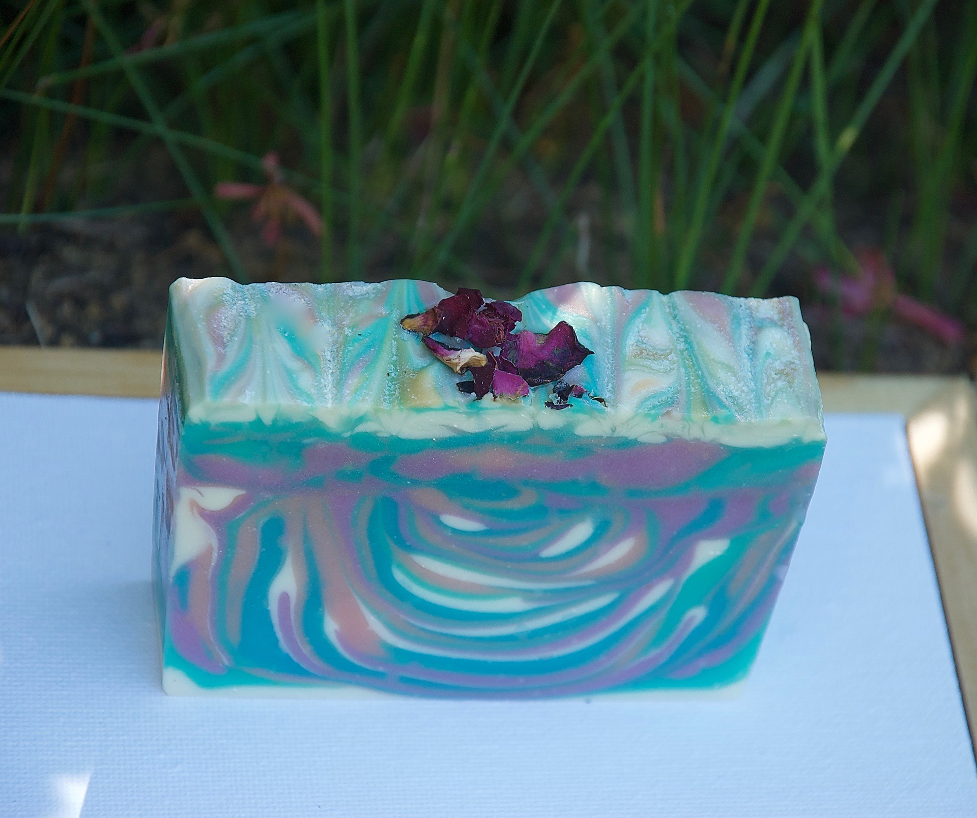
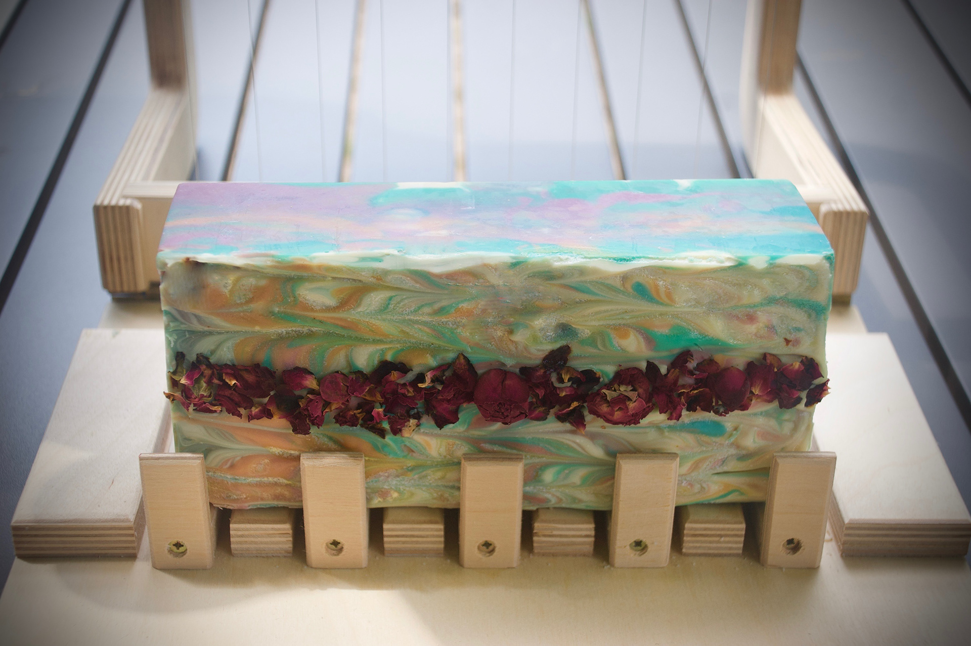
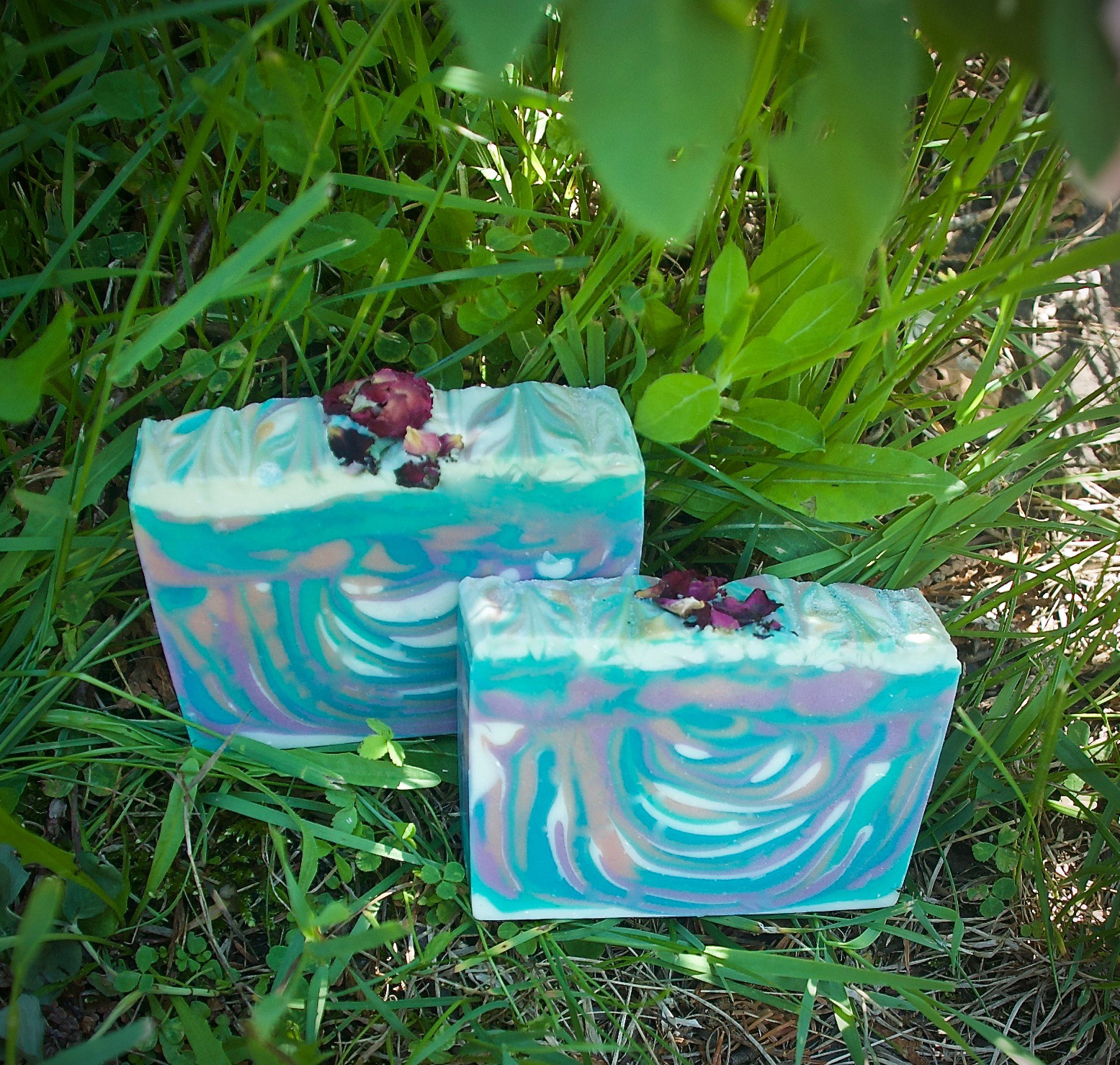
The Product
The Product

–––
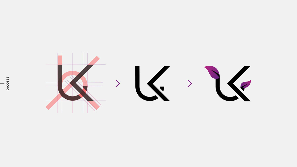
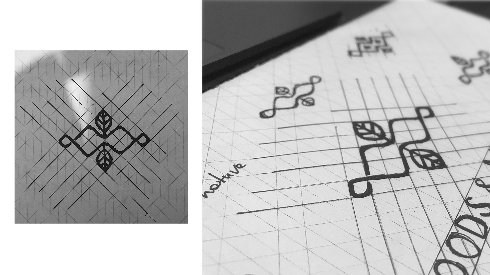
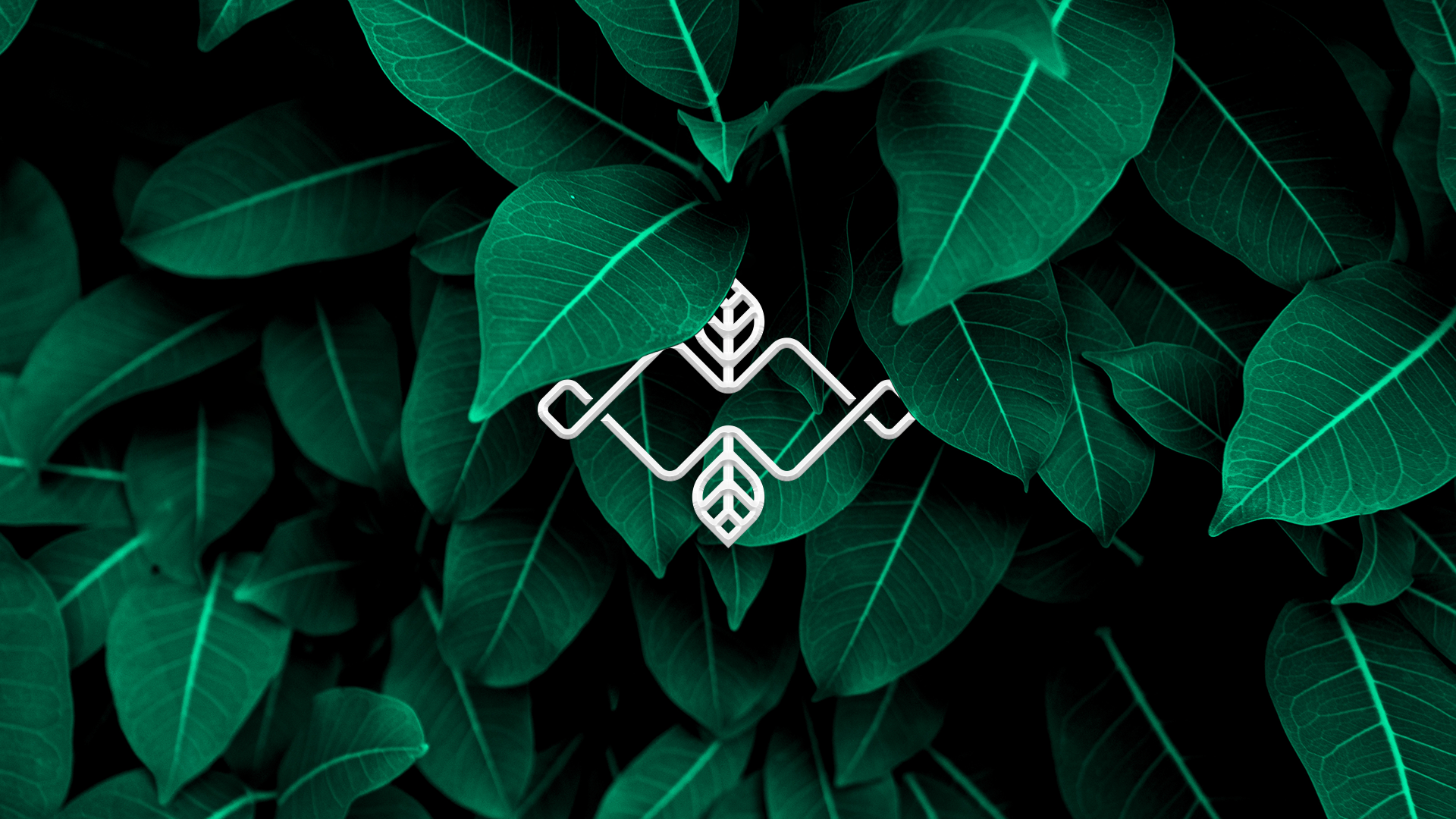
Logo design process
All begins with an idea. The logo should be delicate and tender, be natural and "fresh" as well. I decided to combine such nature elements like leaves and branches with the first letters of the name (W & M). After numerous versions and iteration, I get a clear mark with good recognizable and printing properties.

–––
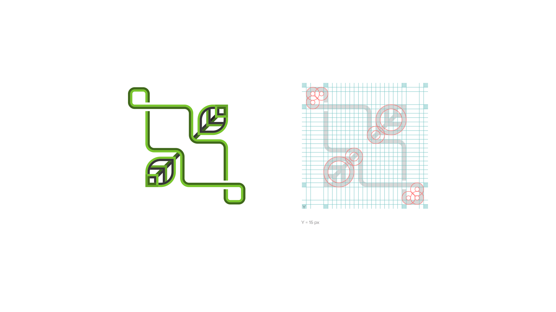
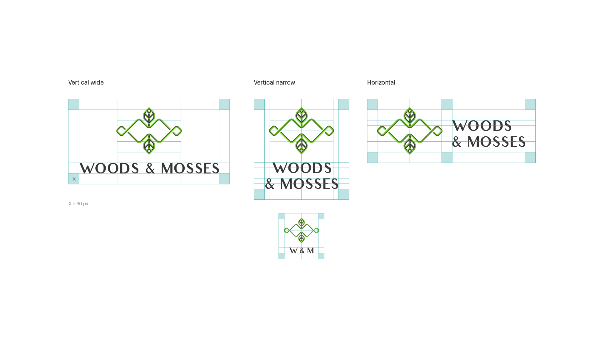
Base grid of the mark
–––
Orientation options
–––
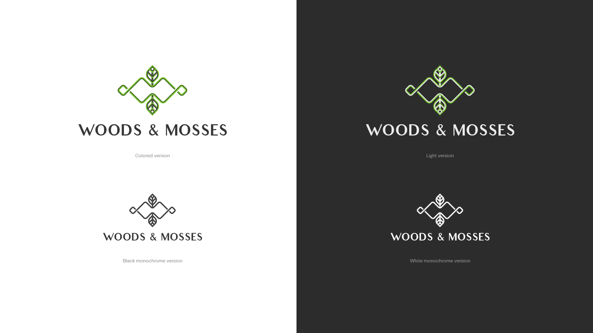
Colour versions
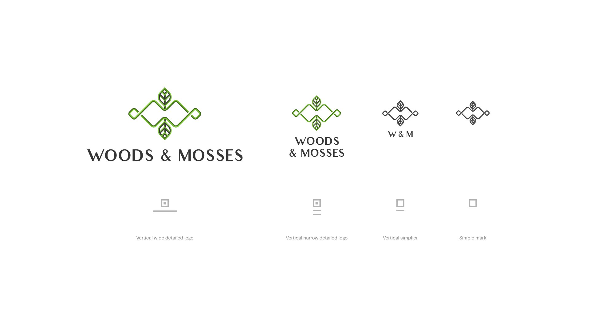
Full and simpler versions
–––
Adaptive versions
While using the logo in smaller size you should use less details
–––
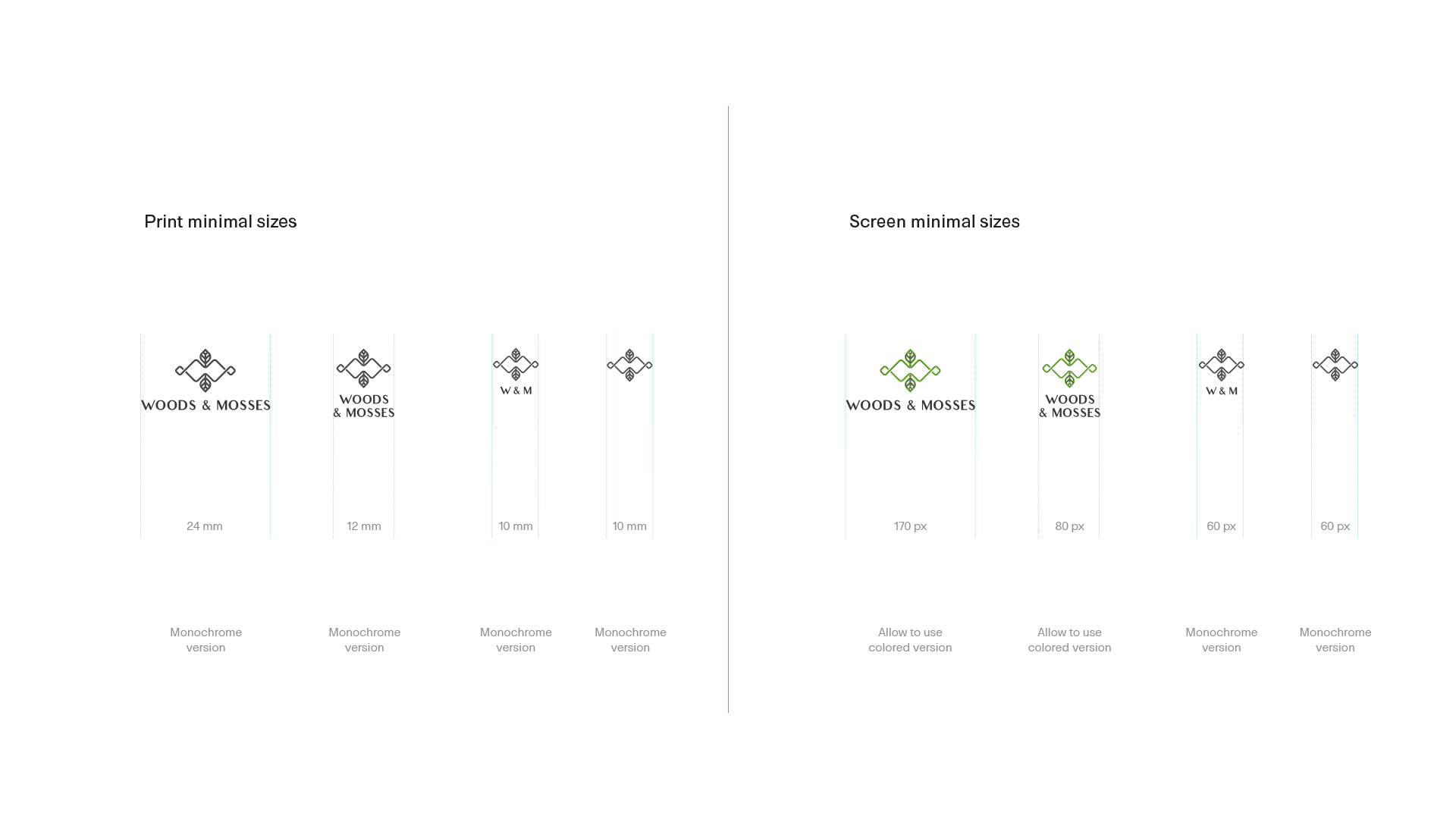
Minimum comfort size
Minimum comfort size
–––
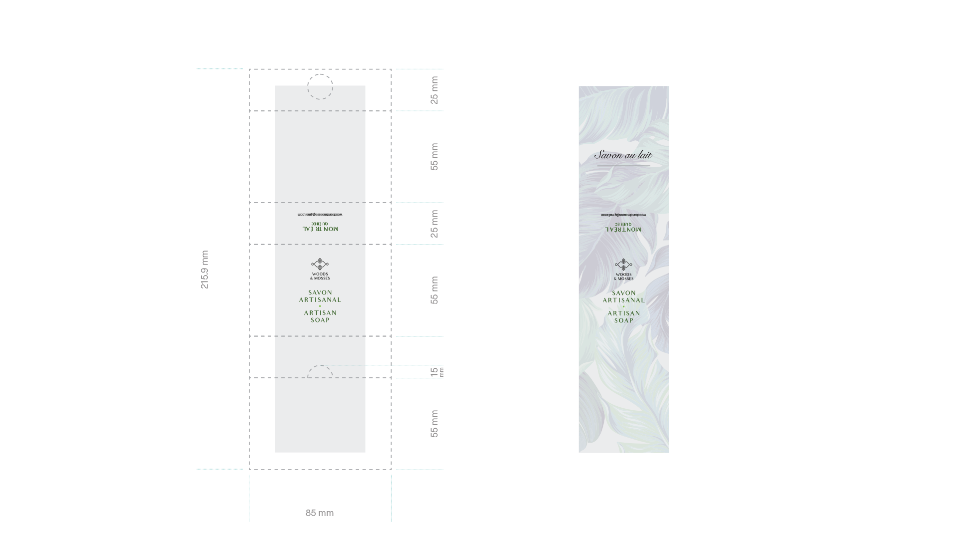
Label scheme
Label scheme
–––
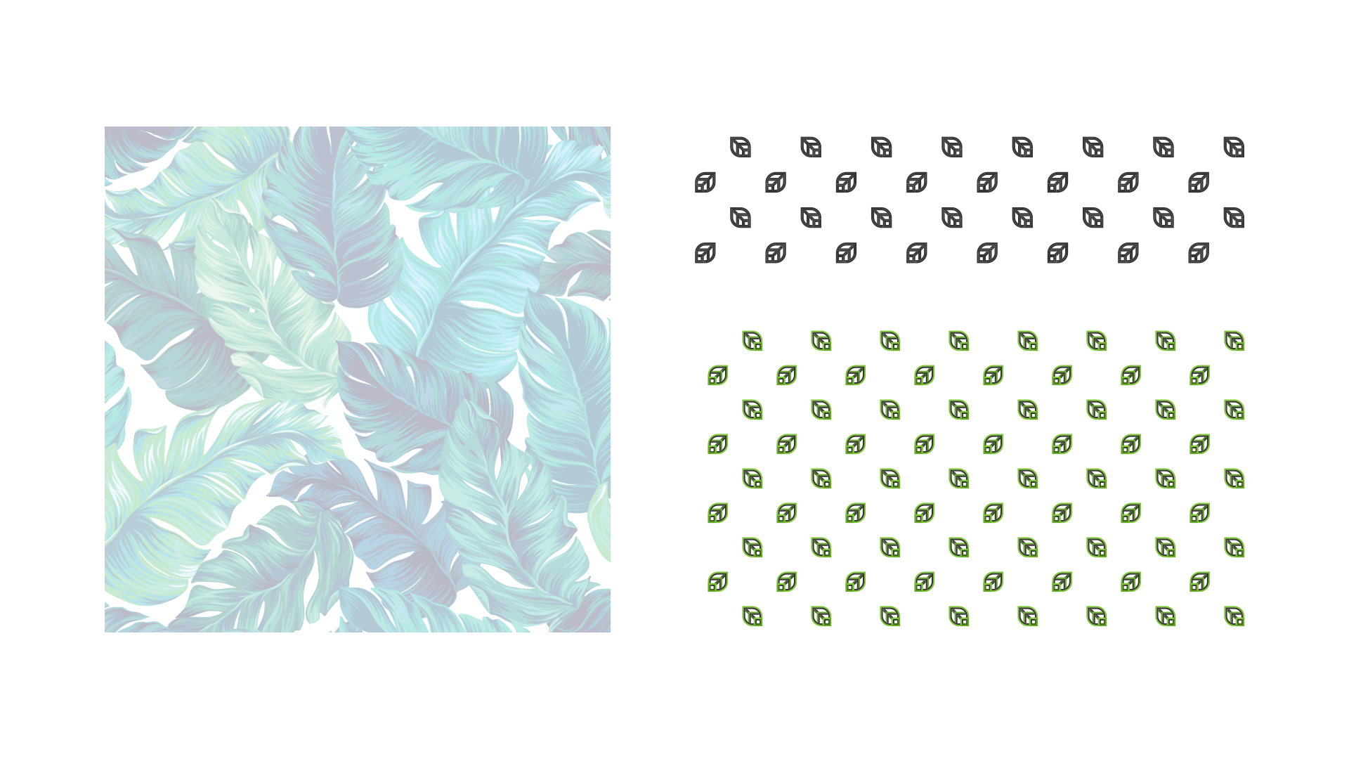
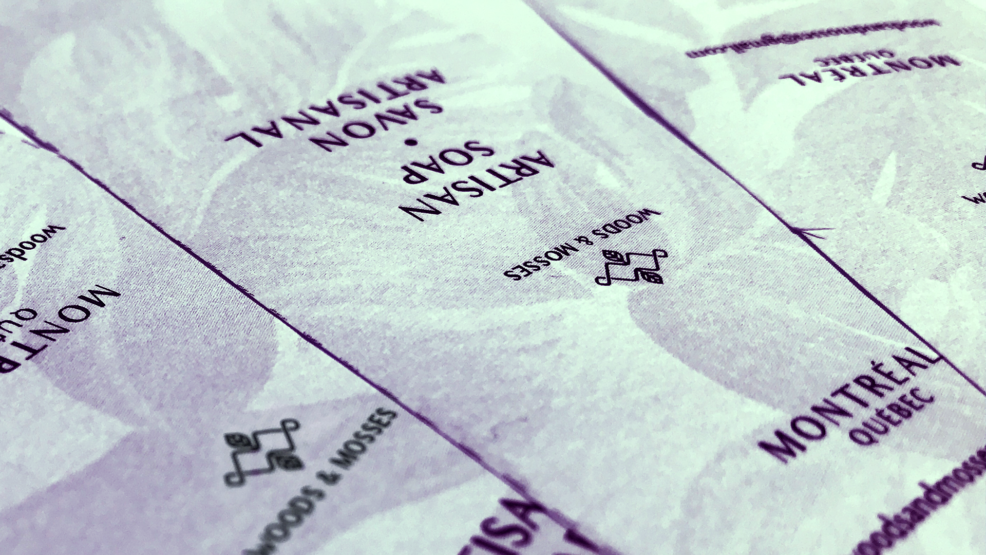
Pattern elements